by Fernando Ripoll on Mar 26, 2018

Tracking the cost of your infrastructure is an important task, especially when you are running a large variety of workloads. It is common for our customers to split workloads by clients, teams and environments (e.g. staging or production) and to run separate Kubernetes clusters for each.
In this post we focus on AWS cost analysis, although most of this advice can applied to other cloud providers as well.
Tagging AWS resources
Our beloved aws-operator uses AWS Cloud Formation (CF) under the hood to manage the AWS resources it creates. This allows us to tag the CF stacks and these are propagated to each resource contained in the stack. The outcome is all AWS resources are tagged and these tags can be used for cost management.
Today we provide by default three tags: “cluster”, “organization” and “installation”. The cluster ID is a unique code we generate for each Kubernetes cluster we provision. On AWS this is also needed for the AWS Kubernetes Cloud Provider to provision Load Balancers and Persistent Volumes.
The second tag relates to the Organization the Cluster belongs to. Organization is defined as a logical group for clusters and users and is similar to an Organization in GitHub. This gives our customers flexibility and they can create Organizations per team or per client depending on their needs.
The final installation tag tracks all resources managed by Giant Swarm in the AWS account. This includes both guest clusters and the host cluster we use to provision our control plane for managing guest clusters and monitoring them.
Getting costs by cluster
With this in mind, we can now profit from the tags and create some nice reports to track our current cluster costs. This also lets AWS predict the cost forecast for the next three months.
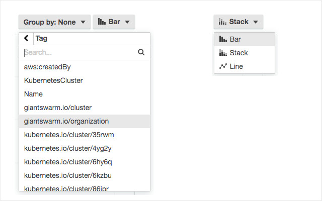
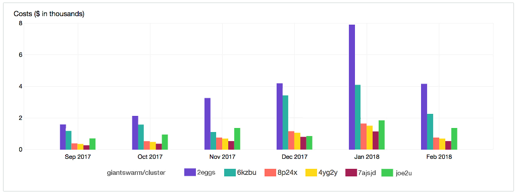
One useful report we find is having the costs for the last six months displayed for each cluster. To configure this open the Cost Explorer in the AWS Console (automatically it browses to the ‘Monthly EC2 running hours costs and usage’ report). There you can select the ‘group by’ value, in the top right corner of the chart, and add the tag ‘giantswarm.io/cluster’. To compare costs between clusters you can change the chart type to ‘bar‘.
You will then have a chart like this:
Getting costs by organization
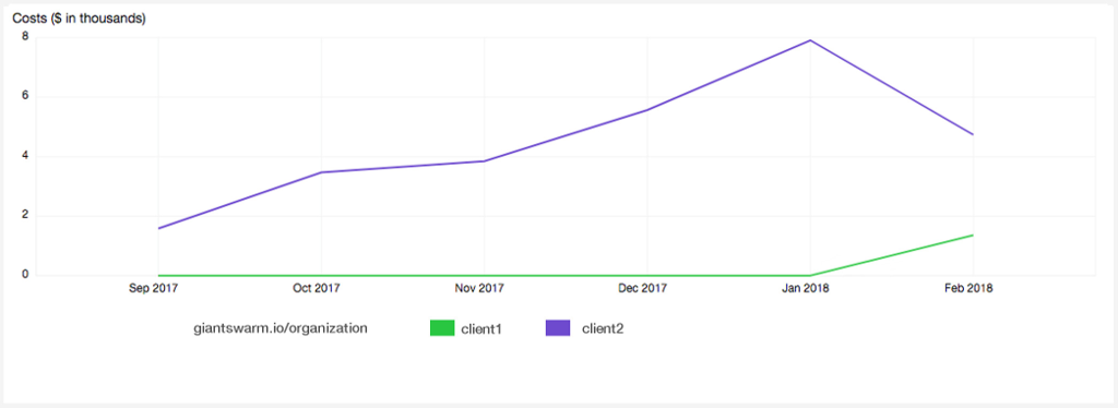
Another example using the Organization tag. Here let’s say we have two internal clients separated by Organization. Client one has two clusters and client two has three. Now you can visualize the costs by client instead of by cluster codename.
If we change the ‘group by’ chart to match ‘giantswarm.io/organization’ now results show us cost grouped by customer. Now to see the cost evolution we can select the chart type ‘line‘ and voilà we have:
After making these modifications to the source report it is good to save them with a different name so they can be stored with the default reports.
Giant Swarm’s goal is allowing our customers to create reports that fit their use-cases, so in our road map we have a story for letting customers provide desired tags by cluster. Thus you could have cost analysis with even finer granularity.
Thanks to Tim Hobbs for taking time to discuss how Service Layers, GmbH track costs.

Why You Should Not Neglect Your Developer’s Kubernetes Clusters
So you’ve finally succeeded in convincing your organization to use Kubernetes and you’ve even gotten first services in production. Congratulations!

You're probably still paying for a VMware licence you no longer need
For years, VMware was the obvious answer. You needed to run workloads, you needed isolation, you needed enterprise support, and VMware delivered all o …

Infrastructure for AI is finally getting a standard
Over the past year, AI has exploded into production, from experimental models to customer-facing apps and internal copilots. But while the models evol …