Our logo is how our customers tell us apart from a crowded industry. It’s a promise of quality, consistency, and reliability. As such, it is vital that our logo is presented correctly in every execution. This section covers these guidelines in detail. Any use of our brand logo outside of or conflicting with the contents of this section will be considered unauthorized.
The brand logo identifies the Giant Swarm brand as a whole. Use this logo to represent our products, service, merchandise, and other. This logo is a carefully created piece of locked artwork that should not be altered in any way.
Clear space, or negative space, is the area that surrounds the logo that is completely clear of any other graphical element. Clear space helps the logo stand out from the rest of the elements on the page and ensures legibility, even at small sizes. As a general rule, the more clear, or negative, space around the logo, the better. At a minimum, there should be clear space equal to the height of the letter "G" in "Giant Swarm" on all four sides of the logo. Using an element from the logo as a unit of measurement ensures enough clear space at any size.
Each brand logo lockup has several color variations for use on different background types, tones, and colors. When in doubt, use the most legible version of the logo for the available background. For printed executions, special care should be given to ensure logo legibility on the final media or material used. Contrast is the name of the game when considering placing the logo on any background. Our logo should not only be legible; it should also make a clear, strong statement when used. If there is not enough contrast between the logo and the background, the presence of the logo is weakened. The logo may not be placed directly on photographs, textures or patterns.
Maintaining optimal and minimal logo sizing is vital to the legibility of the mark and overall brand recognition. The execution will often dictate the right logo size. But in order to maximize legibility, try to use the largest size (within reason) for each logo version listed. In some circumstances, it may be acceptable to use the minimum size. Never reproduce our logos smaller than the minimum sizes listed on this page. The minimum width for the logo is 160 px for digital screens and 28 mm for print.
When used as social media avatars, the icon-only logo should be used with the right amount of clear space on all sides. It's approved for both circular and square avatars shapes of all sizes. While the layout of these avatars should not be altered in any way, approved secondary brand colors may be used to address special events, holidays, and seasonal changes.
It is important to maintain a consistant appearnce. It should not be modified, adjusted or added to. This is not a comprehensive list of errors. These are simply the most common or egregious errors.
 Do not use the stacked version of the logo.
Do not stretch, squash, skew, or distort the logo in any way.
Do not edit the logo color, use an off-brand color, or reduce the logo opacity.
Do not outline the logo.
Do not manipulate or change the logo icon and do not change the typeface.
Do not add graphic effects to the logo, including drop shadows.
Some situations require the use of color tints, especially on the web. For example, when a user hovers over a button on our web site, using a tint change can help confirm their action. If necessary, use a 20% tint step system, keeping legibility in mind. Any white tint below 60% used as a background will require dark text. Tints are also used to expand the primary color palette when creating illustrations.

Iconography is integral part of our merchandising, packaging, website, and wayfinding. We have developed a library of over 50 approved icons that may be used in any brand execution. When it comes to iconography style, we like thin outlines and geometric shapes. If you need to construct new icons, keep the overall shape simple. Reduce the subject matter down to its essence. When placing icons in a layout, they should never be partially cut off.
The icons shape, line weights, and construction should not be altered. Do not use the icons in place of or as an element within our logo. Ensure enough clear space is used so that the subject matter is legible. Here's the full icon library available for download in PNG and SVG formats.
Icon size - adjust icon size based on the image width. All icons used in one instance should have the same image width in px or other units. Align all icons at the top margin line and leave appropriate space at the bottom above the headline.
You can download the full zip file with all icons on this page: https://handbook.giantswarm.io/docs/design/
A - as a general rule, our logo should not be centered in an area. We typically favor a left-aligned layout with the logo aligned to the primary grid line—the spine when dealing wih a one-column printed layout.
B - for two-column layouts you will typically use the bottom-right logo placement, where the document name will be featured in the top-left in mouse type, and the page number will be placed at the bottom-left. Make sure to leave sufficient breathing space between the end of the content and the start of the footer.
C - portrait orientation grids are typically two- columns, with appropriate margins that leave enough space for extended content. Gutters are typically 14 mm on the sides and 10 mm on the top and bottom. Each column should be exactly 86 mm wide and split by a 10 mm gutter.
Make sure to use the same brand color scheme for printed media: (#5b6c79) for body text and (#002645) for headlines.
Cover page headline - 36 pt, bold
Body headline - 12 pt
Secondary body headline - 10 pt, bold
Body text - 10 pt, regular
Mouse type headline - 6 pt, regular
Page number - 12pt, bold


The standard letter size (A4) print layout is composed as a foldable book. This format works best for brochures and handouts, also for digital PDFs. As a general rule of thumb, the optimal number of pages for a printed brochure is 8 (2 of them being blank pages). This way these pages can be assembled into a book-type layout and stapled together.
A - the cover page is composed from the front cover and back cover. The front cover has some small amount of space at the tom for a large title of the brochure and a watermark logo or a QR code on the top-right. The bottom part of the cover is a placeholder for the main graphic and has a dark background. The back cover also has a dark background and usually consists of some short call-to-action text, a small graphic in the middle and contact information at the bottom.
B - when opening the brochure, the first page, which is the other side of the cover, will be blank, resembling an actual book design. The blank page has a watermark logo in the middle. The next page will be the start of the content - the standard two-column layout will be used for all content pages (see example B and C in previous section). You can use bullet points to highlight lists. If the content of full section does not exceed the limits of the page, you can use a quote element or other graphical elements at the bottom to fill in the empty space.
C - the inside pages of the brochure are arranged in a numerical order, with the page numbers placed at the bottom-left of the page. You can use tables, iconography or other graphical elements that follow the brand's color palette and other design guidelines described in this guide.


Business cards are reserved for management and sales roles, but can also be produced for other roles on-request. They are printed on an as-needed basis. If these are not needed for day to day use, do not produce them. We prefer to reduce our usage of paper products. Content on all business cards should follow the included template: nothing should be added or removed.
Size: Standard (84mm x 5mm)
Please follow this link to read more about how to order your business cards: https://intranet.giantswarm.io/docs/people/admin-processes/business-cards/


Giant Swarm's visual language is based on a flat, vivid, illustrated vector graphic style that encompasses the concept of "tech meets nature" described in detail in the Storytelling section above. All graphics are produced exclusively in vector format for maximum compatibility and scalability. This type of format allows us to reuse the same graphics across all types of media, including digital artwork, website and social graphics, print, swag, and others.
This section covers the use of colors when creating Giant Swarm's vector graphics. All colors are based on the official brand colors and are mostly composed from the primary palette colors. Secondary palette colors may be used for additional elements or accents.
A combination of all 4 primary palette colors must be used to compose a graphic that is rich, complete and in-line with the Giant Swarm branding guidelines. The approximate ratio between the primary colors (including their variations and tints) in a graphic should be:
40% Giant Swarm blue - this color is mostly used for all kinds of backgrounds, background elements, shapes or patterns, skyline elements or insides of objects or locations. This color is the most prominent one and is featured the most in order to emphasize the main brand color, which also points back to the logo type and headlines.
25% Vivid Blue - this is the main primary color for all tech-related objects. It is mostly used for computer screens, dashboards, foreground objects, robotic insects and animals, also other objects that are static or 'cold' in their nature. It may also be used for landscape elements like water, snow or sky, depending on the situation. This color is the main driver or storyteller in the graphics and is used for all objects that need to attract the most focus of the viewer. This color may also be mixed with Giant Swarm white or plain white for other objects.
25% UFO green - this color is used to add a second "dimension" to the static and robotic world of tech and tie it in with the more organic and fluid world of nature. This color and it's tints are used for all kinds of greenery, leaves, trees, vines, bushes and other elements. In some cases it may be used be used for other background objects that fit into the context of that specific illustration.
10% Giant Swarm Orange - this is the color that works as a "glue" for all other colors and adds an extra touch to the graphic, pointing back to the main color of our logo and our mascot - the bant. This color should be used as an accent to emphasize small parts or objects in the illustration, e.g. a few buttons, a small part of a dashboard, etc. In some cases it may also be used for other background or foreground objects or even be replaced with a more pink or red shade on special occassions.
Secondary colors - you may use colors from the secondary color palette to highlight parts of objects or to create more contrast where needed.


Dimensions - 1200 x 627 px. This is the standard size for all blog post hero graphics. This format works best when you need to share the blog post on social media - the same banner is used as the featured image for the blog post page. The same color rules and ratios apply when designing these graphics. The design can be either spread out across the dimensions of the banner, or have a more centered layout. In the latter case, it is best to fill in the empty space by adding a semi-visible background or pattern around the main graphic.
Depending on the content of the blog post, we can apply different variations of the color ratios. E.g. if the blog post is more technical, we can design more objects using the Vivid blue color. Also, if the blog post is more "casual" or features some team updates, we can use more green / orange shades when designing objects. As a general rule of thumb - we use Giant Swarm blue for all of our blog post image backgrounds. We may use a different colored background in special cases, which will require special treatment. The background cannot be white.
In terms of environments - we design a world of liminal spaces or natural environments. Do not use characters or real people in the illustrations. The main driving character and storyteller for our branding is the force of nature, which serves more as an "invisible caretaker". We can use robotic / bionic insects or animals as secondary characters, that interact with the environment or objects within the illustration.


Dimensions - 1200 x 627 px. We use the same image dimensions for social post banners. The main rule for text content is that it should not exceed 25% of the image space. All the same color rules apply. We can use a scaled-down version of a graphic that we used for a blog post or in another instance.
The social post banner is mostly used to promote Giant Swarm events, webinars or downloadable assets. The social post banner is composed of the company logo, the title, date of the event (or on-demand if the webinar has already happened) and CTA. All text should be white and the background color of the CTA should be Giant Swarm orange. The CTA should have fully rounded borders. The standard proportions of the banner are 50/50 - half of the banner is used for text content and other information, and the other half is used for the graphic.

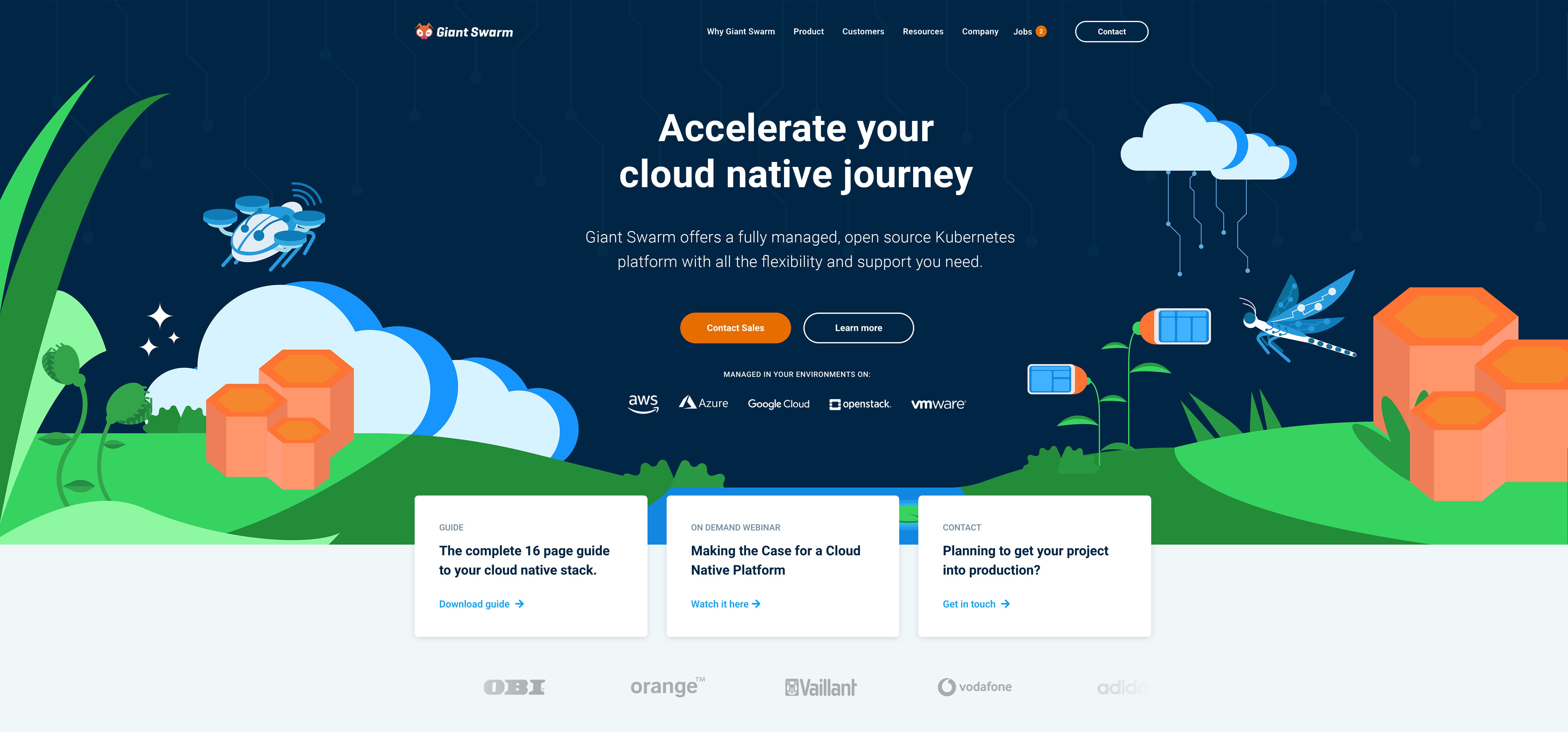
Our color palette makes it easy to design for different types of backgrounds. Most of the graphics are flexible and can be used both on a dark and light background, although some color adjustments my be needed when adapting. The color of the background may vary depending on the use case - e.g. if you need a "filler" section on the website with a different colored background to create contrast. Please keep the color proportions / ratios the same as in other use cases. All backgrounds on the website must be Giant Swarm blue, Giant Swarm white or plain white.

All backgrounds on the website must be Giant Swarm blue, Giant Swarm white or plain white. The first section of a main page (hero section) must use the Giant Swarm blue background color and use a 100% screen width. Other content sections on the page mus use the Giant Swarm white or plain white, with each section using a different color to create contrast. If a page is composed of many sections and has a lot of content, you may include a section with the Giant Swarm blue background color in between the white sections. You can either use a 100% width section or, if there is less content, create a block with rounded edges.


We can use an alternative layout version of the homepage hero section to create additional impact. The graphic of this type of section would be used as a background image and would need special treatment in order to be adjustable for different screen widths. There should be sufficient empty space in the center of the graphic for content and all text, buttons and other elements should be center-aligned. The background color should be Giant Swarm blue, all the same color rules apply.
Sometimes we may need a graphic for a landing page text sections. Typically this type of section would use an equal width 2 column layout, with text in one column and image in the other one. For these type of graphics we can reuse any illustration that we've already created for a blog post, webinar or other. In some cases you may need to add additional background coloring so the elements of the illustration don't disappear on a light background. In these cases, please use a geometric shape that compliments the graphic. Use clipping masks to cut out the illustration to make it fit into the shape.


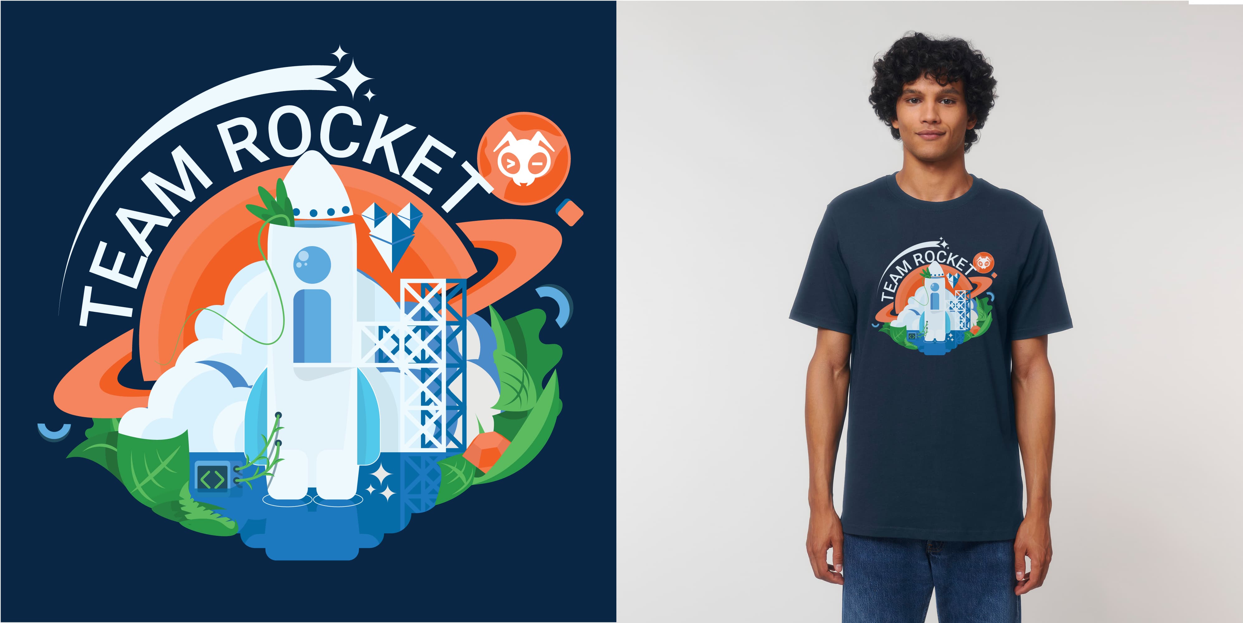
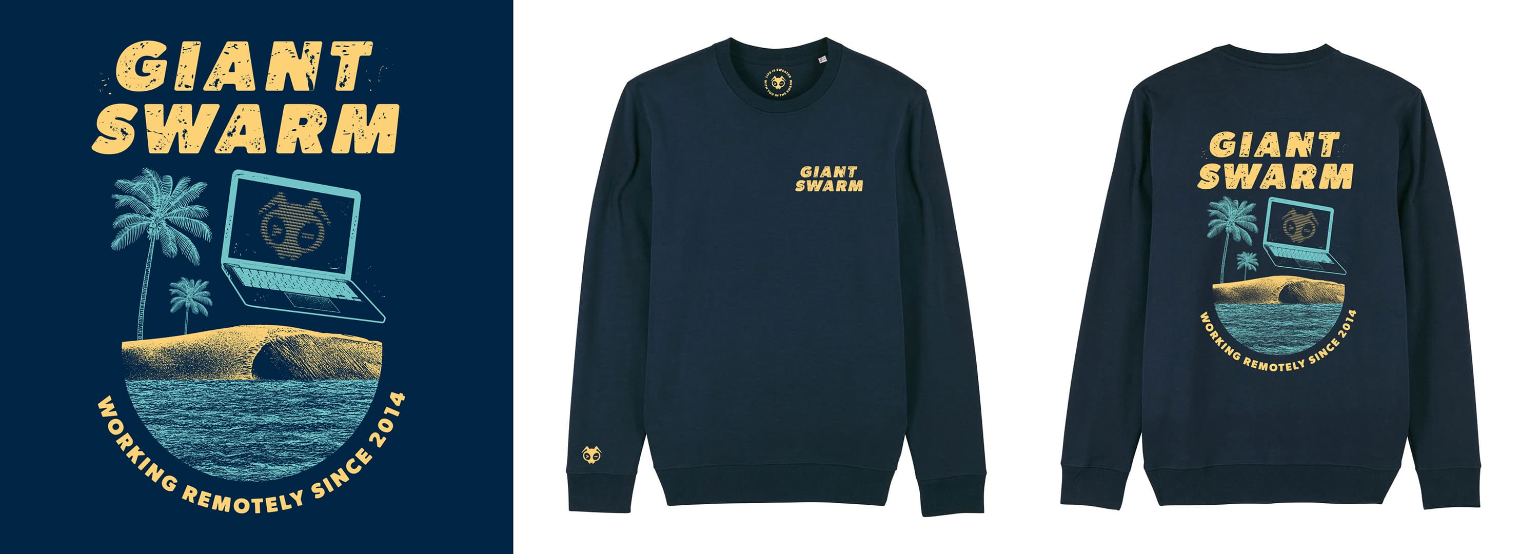
We can apply the same visual style for creating branded graphic T-shirts or other clothing. The same color pallete can be used - it works nicely when transfered from an RGB to a CMYK colorspace, although slight color adjustments might be needed. It works best with a navy blue / royal blue color fabric and can be easily printed with a DTG printing method. This is just one use case of how to use the same visual language and keep the graphic T-shirts in-line with the copmany's branding. For more off-brand styles for SWAG, please see the next section.
We are always looking for creative and fun ideas to keep our employees and customers happy by producing company SWAG. Over the years Giant Swarm has produced a wide range of items including t-shirts, sweaters, caps, skateboard decks, coffee, waterbottles and others. Some of these items are produced exclusively for employees or customers, while others are distributed for free at events or even sold in our online store: https://shop.giantswarm.io/
We like to keep the creative freedom when producing SWAG, that's why we try to separate it from our main branding. There are no specific guidelines when designing these items - everytime we produce something, we generate ideas from scratch and see what works best. This section will provide some examples of what has been done in the past.
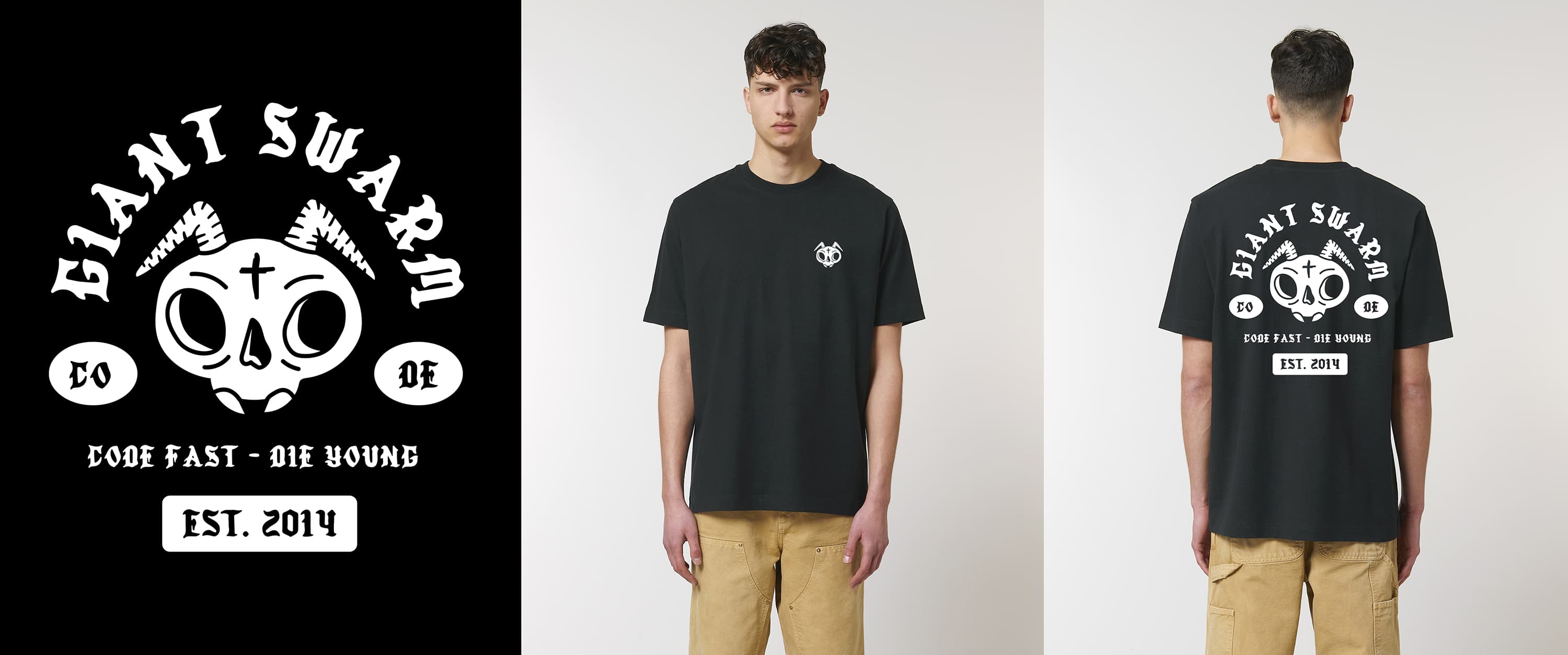
Even though it has been stated in the logo section of this guide, that you can only use the official horizontal logo lockup, we made an exception when it comes to SWAG. This is the only case where an alternative vertical lockup can be used. In addition, the fill color of the logotype has been transformed into an outlie and the color of the logo is not based on the official brand colors, which already breaks at least 3 rules of this guide. But we're all about breaking the rules when it comes to our SWAG.

The badge lockups are different ways of using the logo on SWAG, when a specific look and feel is desired. The badge can be shaped as a circle, rectangle or a custom shape. The most common use is a white badge lockup on a black / dark background. We have used this lockup on towels, black flip flops, football jerseys and as a removable velcro patch on a trucker cap.


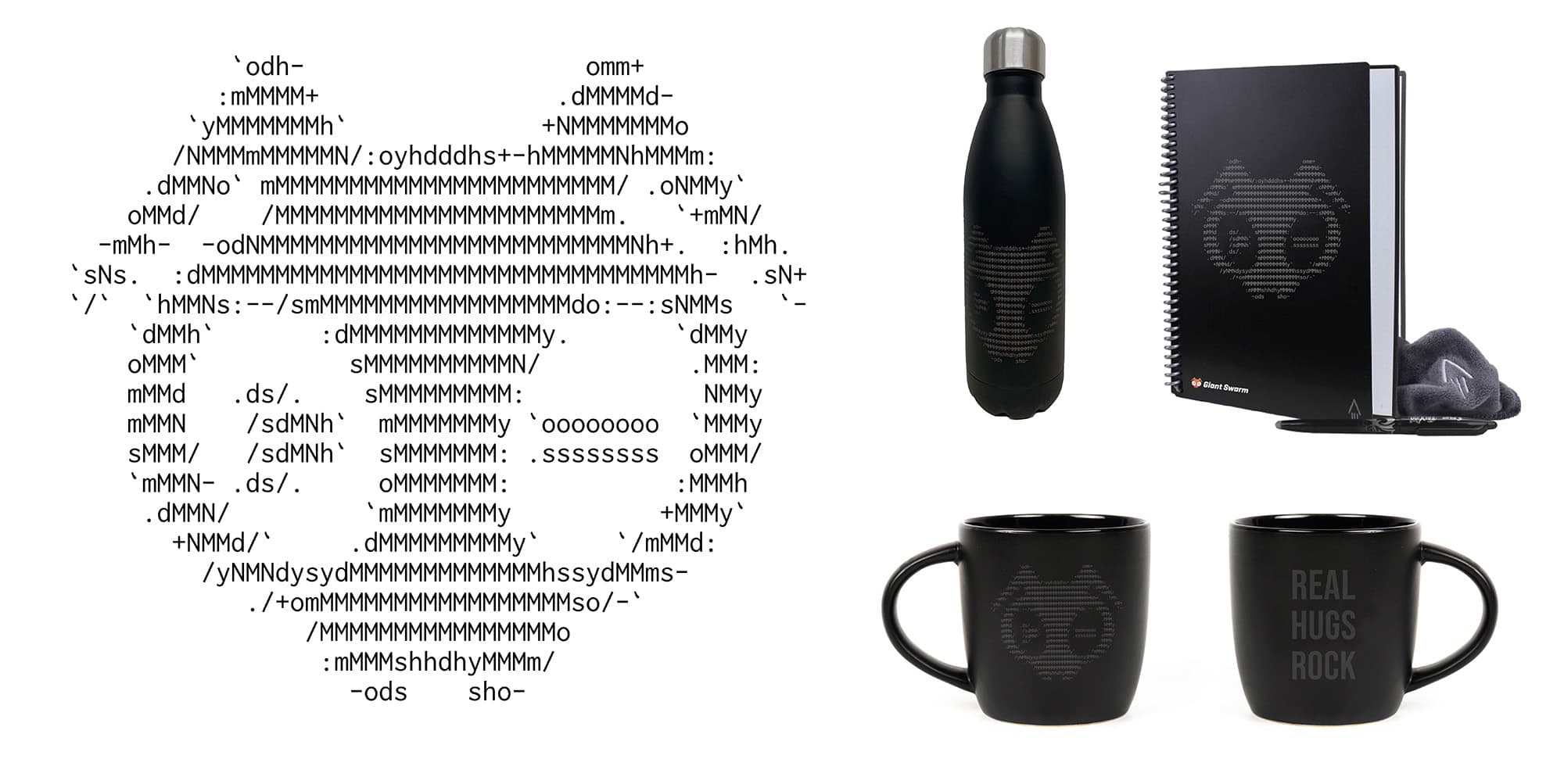
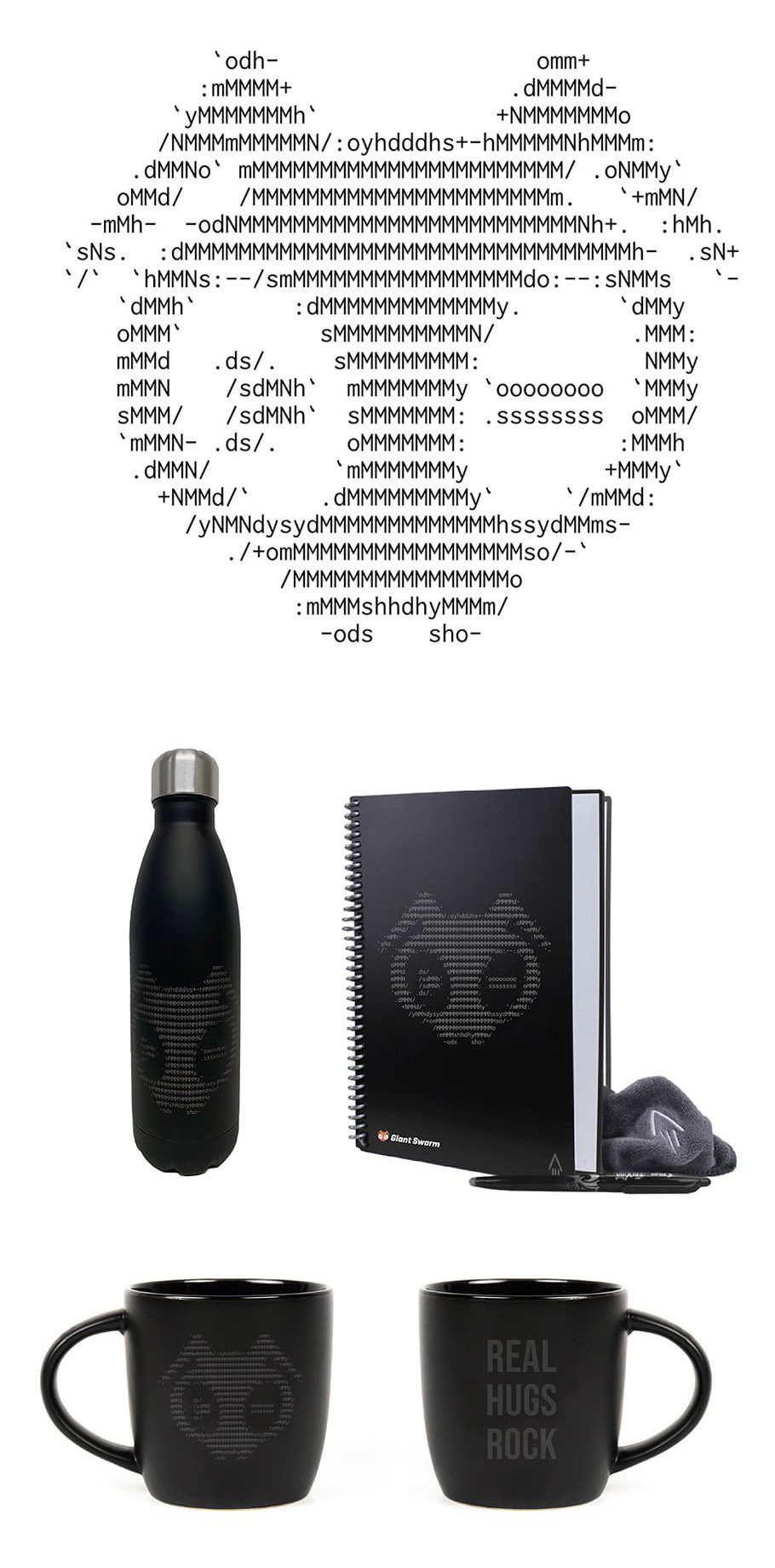
The ASCII lockup is a Giant Swarm timeless classic - it's one of the oldest variations of our logo and it's been used for a wide range of SWAG items including t-shirts, coffee mugs, water bottles and other. This lockup is ideal for use on a black background - you can use a dark shade of grey or engrave it on a black metal surface so it's barely visible. Do not use this lockup as part of the official branding.
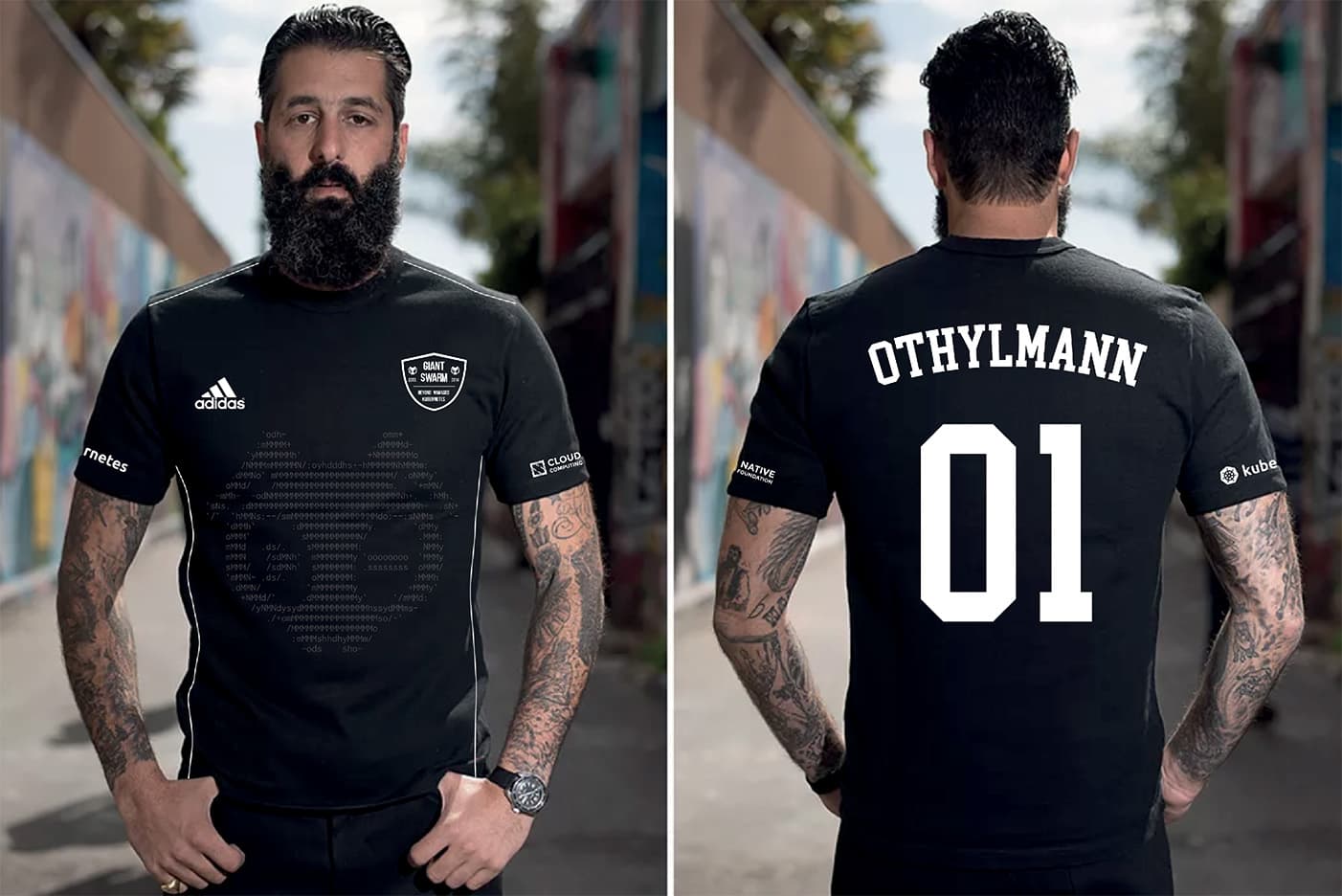
In some cases we can switch the style of our graphics and use a completely different approach for illustrations. E.g. the graphic for the Biker T-shirt is a white on black hand-drawn sketch of the bant, designed in a more cartoon-like style. The navy sweatshirt has a stencil graphic with off-brand colors and a chunky display font with grain to create that vintage feel. The Giant Swarm football jersey uses a barely visible overlay of the ASCII bant lockup on the front and small logos and team crest on the front to resemble a real football team jersey.
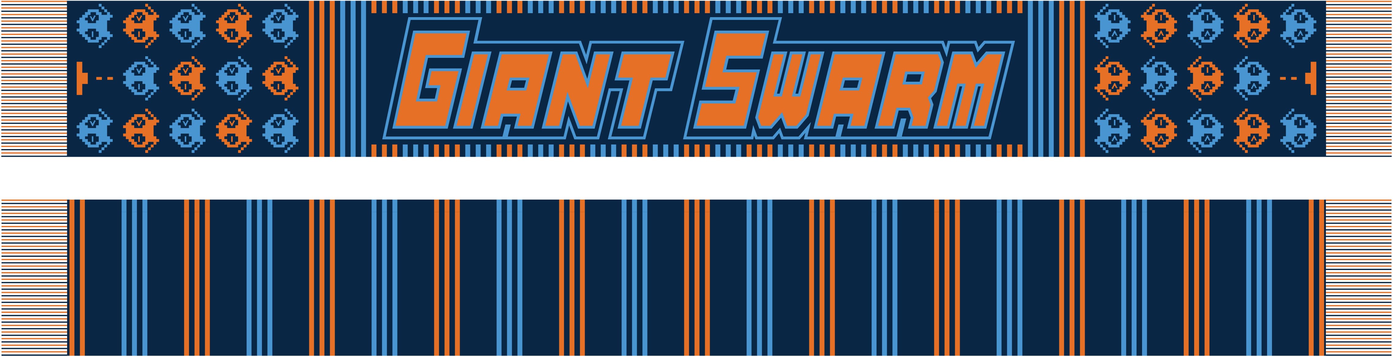
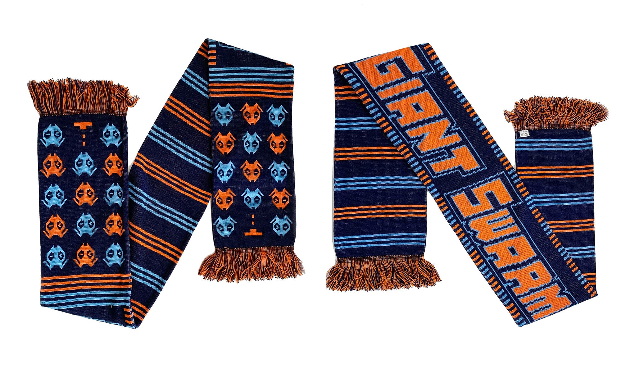
We can also produce SWAG with our official primary color palette. The bright colors work best for various types of patterns or repetitive elements. You can mix and match the colors from the palette to create the best effect and produce bright and colorful designs that stand out in the crowd. Some of the items that we've produced feature a limited edition knitted Giant Swarm fan scarf and Giant Swarm socks.
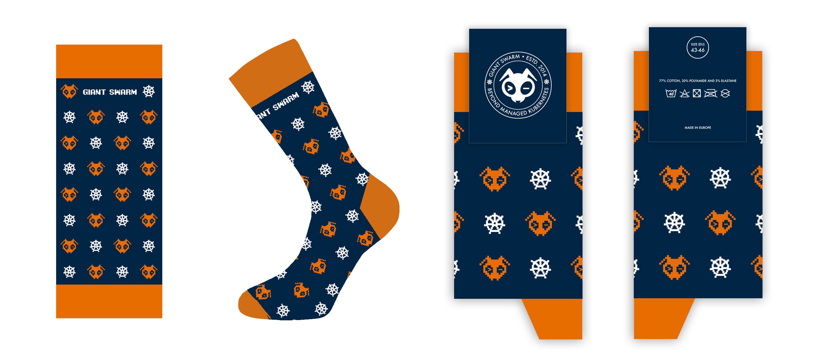
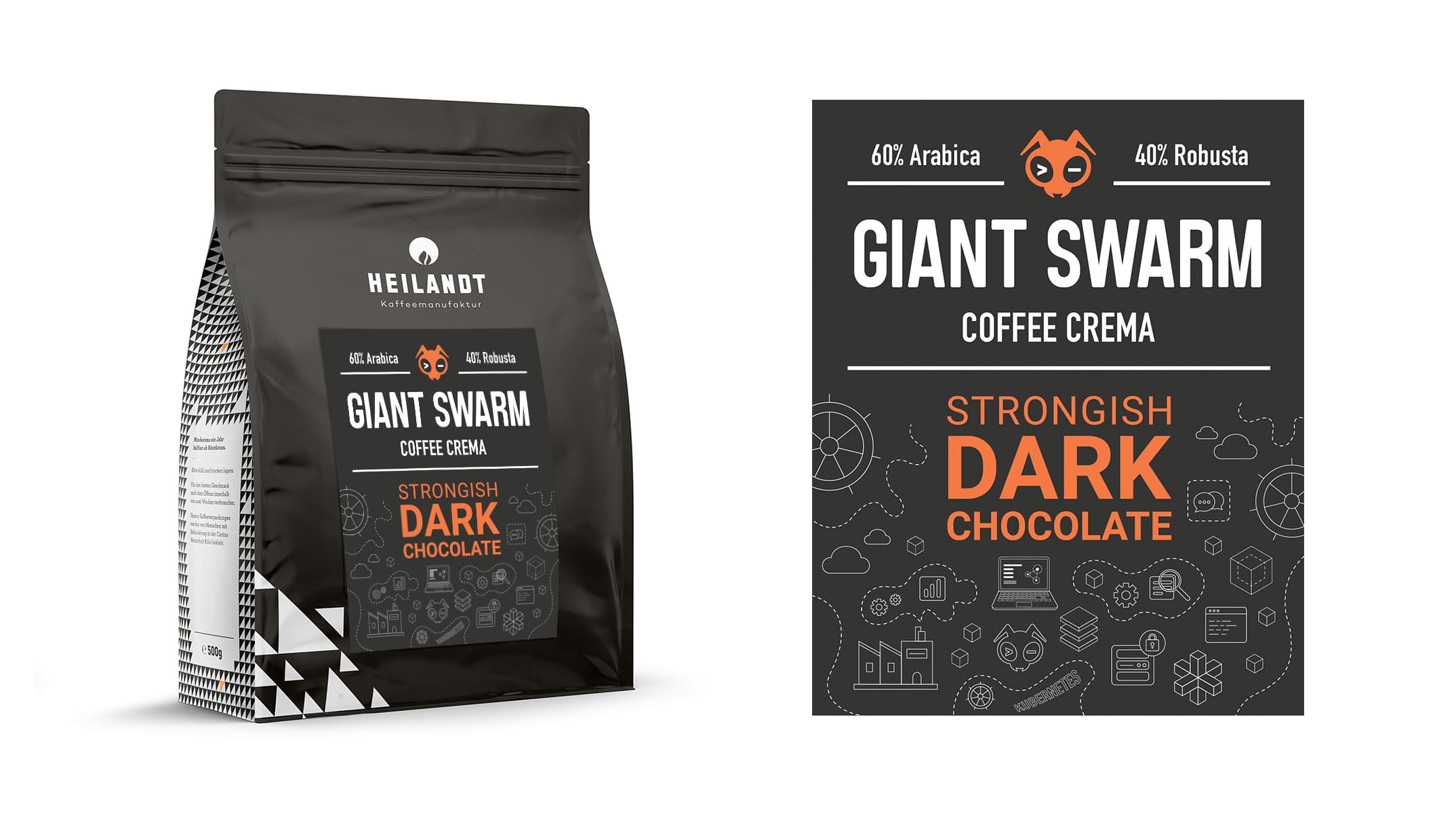
We may use outlined patterns producing SWAG. This is the most common one that has been used in various instances, including coffee packaging or Google slide templates. This type of pattern can be used on any kind of background and can be integrated into another brand's color palette.
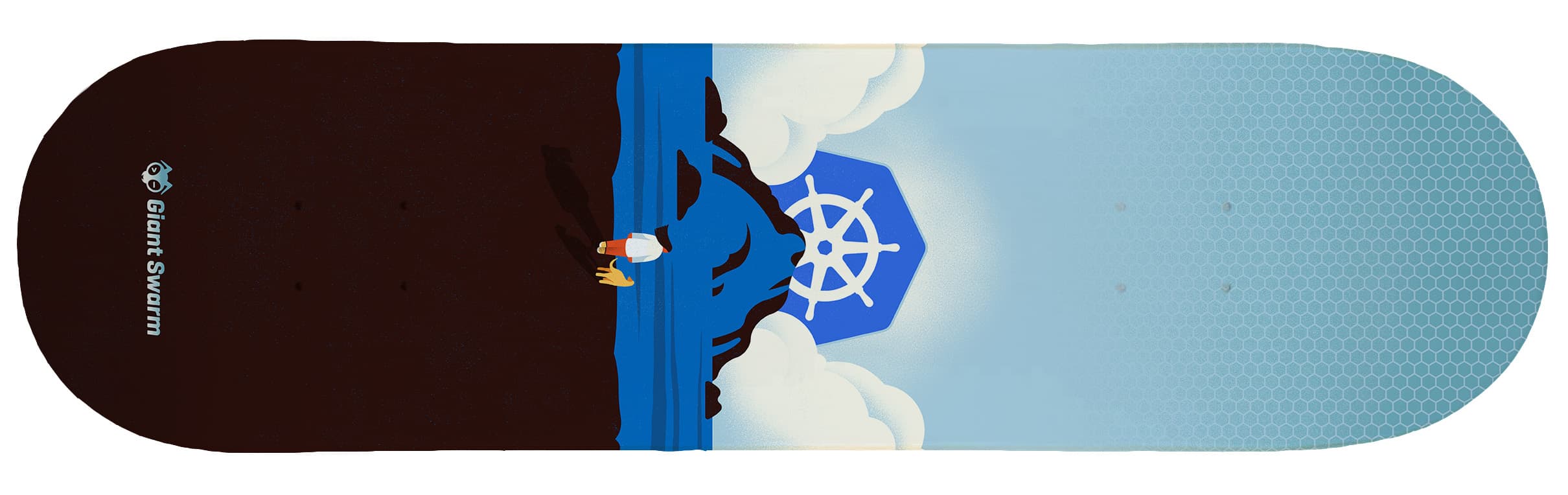
In some cases we choose to collaborate with an external artist to produce an even more exclusive and unique look for our products. In these cases the artist has all the creative freedom to choose what kind of style they will apply to the design. One example is our limited Giant Swarm skateboard deck that was used as a prize in a raffle at one of our conferences.